August 22, 2018
FAOD and Information Architects' dream case
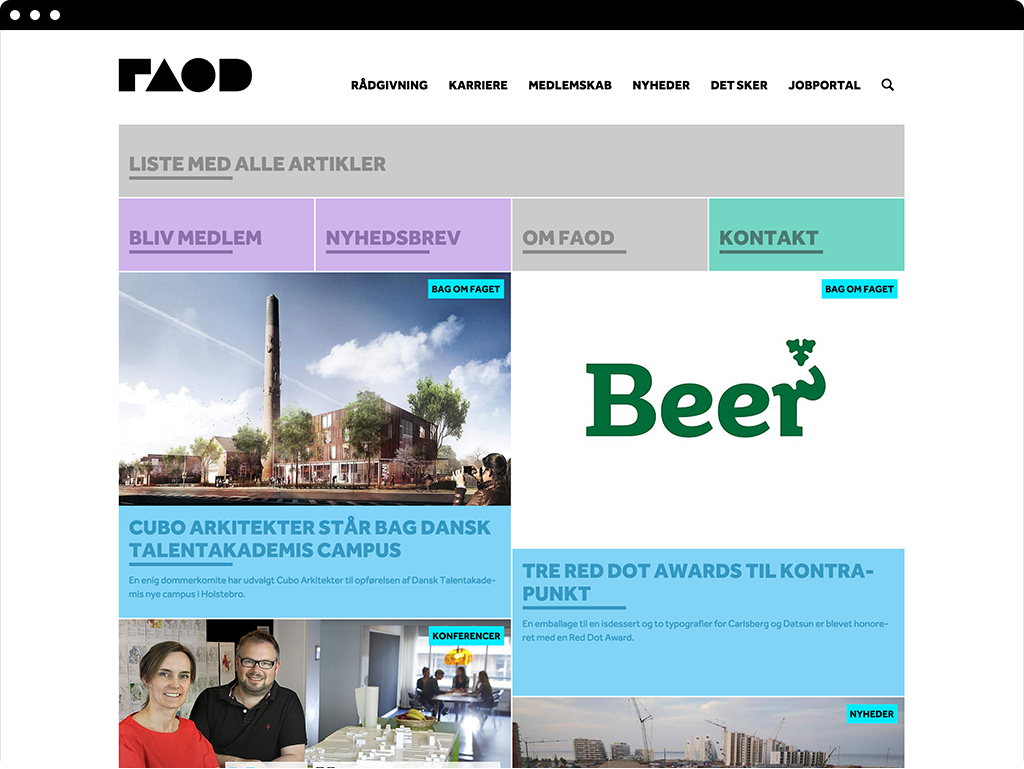
As a part of a major rebranding of FAOD, a Danish union for architects and designers, I was tasked with redesigning their website to meet the needs of their broad target group. The challenge was presenting loads of information up front so the many different users could find exactly what they were looking for.
Proposed solution
The proposed solution where based on two types of navigation. In the top of the site an extensive, yet simple navigation bar providing a full overview of the websites content. Scrolling or browsing down, a Mondrian-like tile based front page where important information could be presented side-by-side of news articles.
The process
Creating an overview of the existing FAOD website.
Identifying target group and stakeholders of FAOD.
Rearranging content into a redesigned information architecture.
Iterations
Design wireframes for key pages
Implementation

